
Showing posts with label black and white. Show all posts
Showing posts with label black and white. Show all posts
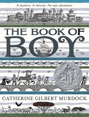
Tuesday, February 6, 2018
The Book of Boy is Here!
Sunday, October 26, 2014
Follow the Waffles
 I drew these tiny, semi-faceless critters on scratchboard, while experimenting for The Twistrose Key.
Sunday, April 28, 2013
These Pigs Could Be Yours

Wednesday, June 6, 2012
New, Old Pig on the Block

He looks sort of familiar, eh? That’s because I took a color xerox of a painting I did a dozen years ago, mounted it on illustration board, then started to retouch and, I hope, improve on my earlier work. I had based the original on a photograph of Abraham Lincoln’s son Willie, but thought the proportions needed adjusting to make him less human and more pig-like. I also fleshed out his surroundings, gave it all a warmer tone, and pretty much repainted the whole thing.
Sunday, November 20, 2011
An Illustration from The Apothecary
 This is one of my favorite illustrations from The Apothecary and one of the ideas that came to mind when I first read the manuscript.
 But sometimes the most simple ideas are the most difficult to execute. I couldn’t get the sky or the waves “right” and kept painting over and over again, getting nothing but more unhappy.
When I was in almost tearful despair, my cat Buzz jumped on my scanner and sent it clattering to the floor, and so I decided to see if it still worked by scanning my frustrating picture. And then I started tinkering with the image in Photoshop and within a few minutes I finally got the “feeling” I’d been after since that first read. My Photoshop skills are pretty rough, though, so I spent the next few days copying in ink and paint what I’d done on the computer.
Tuesday, October 18, 2011
The Blue Horse Auction is Underway!

If you’d like to take this blue horse back to your stable, now’s your chance:
He’s up for auction and can be found on The Artist Who Painted a Blue Horse Charity Auction website and on Ebay.
The auction ends Wednesday, October 26, 2011, at 9:01 p.m. (Pacific Daylight Time) - which is just after midnight October 27th on the East Coast.
Bid early. Bid often. Support a worthy cause. Help a horse out.
Friday, September 30, 2011
A Blue Horse?
For better or horse worse, I’m becoming a specialist in painting forlorn animals in old clothes - as seen here, here, here, and here - and now here:

“Blue Horse in Black and White” by Ian Schoenherr (2011)
I painted this sad creature for a good cause, though:


The directive was to create “a piece of original artwork featuring [my] interpretation of a horse in any color, size, shape or medium of [my] choosing, inspired from [my] reading of The Artist Who Painted a Blue Horse” on an 8 x 8" canvas (on which the legend seen in the picture was printed, by the way; my lettering isn’t that good).
I guess I interpreted this directive broadly.
Anyway, this could be yours, once the online auction begins on or around October 17, 2011. The site www.BlueHorseAuction.com will be up and running once all the entries are received and photographed. I’ll post a reminder and more details as they come.
“Blue Horse in Black and White” by Ian Schoenherr (2011)
I painted this sad creature for a good cause, though:
The Artist Who Painted a Blue Horse Charity Auction is a silent auction to benefit the NEA Foundation’s commitment to help improve arts education in schools across the nation. The initiative was inspired by Eric Carle’s picture book The Artist Who Painted a Blue Horse, which celebrates imagination and artistic freedom.
The directive was to create “a piece of original artwork featuring [my] interpretation of a horse in any color, size, shape or medium of [my] choosing, inspired from [my] reading of The Artist Who Painted a Blue Horse” on an 8 x 8" canvas (on which the legend seen in the picture was printed, by the way; my lettering isn’t that good).
I guess I interpreted this directive broadly.
Anyway, this could be yours, once the online auction begins on or around October 17, 2011. The site www.BlueHorseAuction.com will be up and running once all the entries are received and photographed. I’ll post a reminder and more details as they come.
Thursday, May 26, 2011
Study for The Apothecary
 This is an experimental study I made last summer when I was trying to get a feel for the illustrations for The Apothecary.
It’s in ink and acrylic on watercolor paper and is much more “thinly” painted than the final art: try as I might, my light touch always gives way to impasto and opacity. Last night I got see see a roomful of illustrations at the ABC Children's Group at ABA Silent Auction to benefit the ABFFE Fund for Free Speech in Children’s Books - and I really marveled at the ease and confidence shown in so much of the work. How do they do it? One of these days, I’ll apply a flat tone of color and let it be - and not muck around in it.
(This piece was in the show, too - and the winning bid was $500!)
Friday, May 20, 2011
Physician, Take a Hike
 Kind of creepy, eh? This showed up in The New York Times Book Review for May 12, 2002, and illustrated Natalie Angier’s review of Michael Gearin-Tosh’s memoir, Living Proof: A Medical Mutiny.
As Angier said, Gearin-Tosh, who had been diagnosed with incurable bone marrow cancer, took “his body, his health, his life into his own cautious, obstinate hands. Gearin-Tosh refused the chemotherapy - hence the subtitle of ‘Living Proof’: ‘A Medical Mutiny’ - and chose instead to put together a semipersonalized program of Chinese breathing exercises, acupuncture, coffee and castor oil enemas, megadoses of vitamins and a diet rich in raw vegetables and fresh juices and stripped of salt, sugar and cooked fat.”
So, in lieu of any better ideas, I drew a kind of “universe” of Gearin-Tosh’s alternative medical regimen: the human head functioning as a kind of a sun, with acupuncture needle-rays, orbited by vitamin-stars, garlic- and turnip-asteroids, apple- and orange-planets, carrot- and onion-comets, banana- and pea pod-moons, and ...an enema-bag space-station? Sounds like the worst bowl of Lucky Charms ever.
Monday, May 16, 2011
They Really Are A Scream
Sometimes a better idea comes after I’ve turned in the final art. Other times the best idea arrives in the nick of time.
Take the Adams family. (No, not them.) My assignment for the New York Times Book Review (given on a Friday afternoon, I think, and due before noon Monday) was to illustrate Jeff Shesol's review of America's First Dynasty: The Adamses, 1735-1918 by Richard Brookhiser, in which “his subject is not one life but four - the favorite sons of successive generations of the Adams family” - i.e. John Adams, John Quincy Adams, Charles Francis Adams and Henry Adams.
For better or worse, I’m drawn to American historical subjects: I love to research them, but often I get too caught up in all the details which, in turn, can get in the way of making an interesting picture. Editorial work, though, is (to me) less about making a well-researched or historically accurate depiction of a particular time, place, or person, and more about making something that catches the essence of the piece it illustrates - or, at least, catches the eye.
Despite my immediate attraction to the subject, I didn’t know how to handle it pictorially. One page of notes shows that I considered parodying (or parroting) The Flying Wallendas and The Brady Bunch...

“Clever” - but not very interesting. Nor was the “family gallery” approach I tried, or my half-baked variant of Norman Rockwell’s The Gossips...

Finally, while vainly attempting to capture the features of Charles Francis Adams, it dawned on me that most people probably wouldn’t pick be able to pick Charles Francis Adams (or even Henry Adams) out of a line up, so why bother with straightforward portraits? Why not focus on things they had in common besides their surname: their eyes, their ears, their bald heads? And why not take a more abstract, or less literal approach, which might be more effective in the end?

Maybe I pushed the similarities more than what was “true,” but I felt like I was on to something. And maybe I was paying unconscious homage to one early-to-mid-1960s album cover or another - was it Meet the Beatles!? I don’t know.

And since David McCullough’s John Adams came out not long before this review appeared, I figured the Times-reading masses would probably recognize the Adams on the jacket:


So I replaced John Adams’ understated hairstyle with the bushier variety. But that obscured the face of his son, John Quincy Adams, so I switched the order, tracing and cutting and pasting (with real-live scissors and tape)...

And then I made the final art in ink on scratchboard:

My chief reservation about this is that my pen and “scratching” work should have been less delicate: it gets fuzzy when reduced, or printed on newsprint. Even so, I still like this Adams Family. Neat, sweet, petite.
Take the Adams family. (No, not them.) My assignment for the New York Times Book Review (given on a Friday afternoon, I think, and due before noon Monday) was to illustrate Jeff Shesol's review of America's First Dynasty: The Adamses, 1735-1918 by Richard Brookhiser, in which “his subject is not one life but four - the favorite sons of successive generations of the Adams family” - i.e. John Adams, John Quincy Adams, Charles Francis Adams and Henry Adams.
For better or worse, I’m drawn to American historical subjects: I love to research them, but often I get too caught up in all the details which, in turn, can get in the way of making an interesting picture. Editorial work, though, is (to me) less about making a well-researched or historically accurate depiction of a particular time, place, or person, and more about making something that catches the essence of the piece it illustrates - or, at least, catches the eye.
Despite my immediate attraction to the subject, I didn’t know how to handle it pictorially. One page of notes shows that I considered parodying (or parroting) The Flying Wallendas and The Brady Bunch...

“Clever” - but not very interesting. Nor was the “family gallery” approach I tried, or my half-baked variant of Norman Rockwell’s The Gossips...

Finally, while vainly attempting to capture the features of Charles Francis Adams, it dawned on me that most people probably wouldn’t pick be able to pick Charles Francis Adams (or even Henry Adams) out of a line up, so why bother with straightforward portraits? Why not focus on things they had in common besides their surname: their eyes, their ears, their bald heads? And why not take a more abstract, or less literal approach, which might be more effective in the end?

Maybe I pushed the similarities more than what was “true,” but I felt like I was on to something. And maybe I was paying unconscious homage to one early-to-mid-1960s album cover or another - was it Meet the Beatles!? I don’t know.

And since David McCullough’s John Adams came out not long before this review appeared, I figured the Times-reading masses would probably recognize the Adams on the jacket:
So I replaced John Adams’ understated hairstyle with the bushier variety. But that obscured the face of his son, John Quincy Adams, so I switched the order, tracing and cutting and pasting (with real-live scissors and tape)...

And then I made the final art in ink on scratchboard:

My chief reservation about this is that my pen and “scratching” work should have been less delicate: it gets fuzzy when reduced, or printed on newsprint. Even so, I still like this Adams Family. Neat, sweet, petite.
Sunday, May 15, 2011
“...all the way home to BEA”
 Give this little pig a good home, please. He’ll be waiting for you later this month at BookExpo America (a.k.a. BEA):
BEA Art Auction to Benefit Free Speech for KidsYou might recognize this pig. For the auction, I took a color xerox of my painting, mounted it on illustration board, then did a fair amount of repainting - beyond just turning the oval into a rectangle. He comes framed, too.
Attendees at BookExpo America will have an opportunity to support the free speech rights of young readers when the children's art auction and reception that formerly benefited the Association of Booksellers for Children (ABC) is relaunched as a fundraiser for the new American Booksellers Foundation for Free Expression (ABFFE) Fund for Free Speech in Children's Books. The event will be held on Wednesday, May 25, in the Javits Convention Center from 5:00 to 7:30 p.m.
The ABC Auction has long been one of the most eagerly anticipated events on the social calendar of the children's book industry, attracting booksellers, authors, publishers, illustrators, and others. This year's auction is chaired by author Laurie Halse Anderson, whose novel Speak has been challenged in schools by people who object to its exploration of sexual assault. More than 100 artists have donated work to the auction. A preview is available online.
Tickets for the auction and reception, which are $69 for bookseller members of the ABC Children's Group and $89 for all others, can be purchased here. If the tickets are not sold out in advance, they may also be purchased during a preview of auction artwork in the Javits Center's Crystal Pavilion on Tuesday, May 24, from 9 a.m. to 5 p.m. Tickets purchased onsite will be $79 for ABC members and $99 for non-members.
Wednesday, May 11, 2011
May It Please the Court: The First Amendment
 A jacket for May It Please the Court: The First Amendment: Live Recordings and Transcripts of the Oral Arguments Made Before the Supreme Court in Sixteen Key First Amendment Cases.
This box set was published by The New Press in 1997. As I recall, Charles Nix, who had designed the first volume - May It Please the Court: The Most Significant Oral Arguments Made Before the Supreme Court Since 1955

Monday, May 9, 2011
“Unbelievibly Crazy” Book Jacket
 My jacket art for The Breaking of the American Social Compact by the recently vilified Frances Fox Piven and Richard A. Cloward and published by The New Press.
 Recently, one Amazon reviewer called the book “unbelievibly crazy,” and warned, “I can't believe how some people actually believe this stuff. This is not for Americans. It's for socialists. Lord help us all!”
For me, though, it was a chance to experiment in low-tech 3D. My friend and then-business partner, Charles Nix, did the type design which I then “interpreted” in ink and acrylic by “cleverly” adding the “crack” through the “chiseled stone” letters. As with Getting Near to Baby, my black and white original (below, uncropped) was colorized in printed form.

Getting Near to Baby’s Jacket
 My jacket for Audrey Couloumbis’ Newbery Honor award-winning novel, Getting Near to Baby.
I painted the original in black and white ink and acrylic and the blue sky color was added in production (I was afraid to do it in two colors myself, so I relied on G. P. Putnam’s Sons’ Art Department to get the desired hue).
My niece Nyssa unwittingly posed for Willa Jo Dean, the girl on the left. By “unwittingly” I mean that I had several dozen photos of Nyssa left over from our work on Amy Littlesugar’s Jonkonnu (see a link and some reviews on the left hand side of this page), so I adapted one or two snapshots of her for this project.
And I just discovered the Chinese edition!

Woodside Trolley Barn Door

Woodside Trolley Barn Door by Ian Schoenherr (1986)
My family called the sprawling brick structure at the corner of Woodside Avenue and Northern Boulevard the “Trolley Barns,” but it was, more officially, the depot of the New York and Queens County Railroad Company.
Most of it was pulled down in the late 1980s, but not before I inadvertently documented it in a few “artistic” photos, including this one of a boarded-up doorway on Woodside Avenue.
My parents, all four grandparents, two sets of great-grandparents, a great-great-grandmother, and a great-great-great-grandmother (who came over from Ireland before the Great Famine and was married to a Tammany Hall-connected shoemaker who became a Keeper of City Hall Park in Manhattan) and countless aunts, uncles, and cousins have lived within a few blocks of the place.
Read more about it at the great Forgotten New York site.
Tuesday, May 3, 2011
Alexander Hamilton and George Washington
Jean Fritz’s George Washington's Breakfast and And Then What Happened, Paul Revere? really spurred my interest in American history, so it was a treat to make a few illustrations for her latest book, Alexander Hamilton: The Outsider.

(It’s also available via Indiebound.)
The book was to be illustrated with many old engravings and drawings (including several by Howard Pyle) and my role was to create a frontispiece and five “section openers” that would hint at the themes discussed in the subsequent chapters, but which would not necessarily be literal depictions of specific events. More “evocations” than illustrations.
For the section titled “Aide-de-Camp” I needed to show Hamilton with George Washington, who had picked the young officer to serve on his staff in 1777. Although he was a proven and gallant fighter, Hamilton’s job mostly involved writing, but he got to a point where, as Ron Chernow says in his monumental biography:

But I got carried away with symmetry of the thing, and the figures began to look too much like an antique jumping-jack toy. So I started over. This time I placed them outside, as if on the way back from inspecting the soldiers’ cabins at Morristown or at Valley Forge, Pennsylvania.

I wasn’t so sure about Hamilton’s headgear, though: he was an artillery officer, but I thought that, while serving as Washington’s aide, maybe he wore a tricorne hat, so I replaced the more helmet-like cap in the final art. I also added a decorative border to the final art, which I made with ink on scratchboard. And voilà!

(It’s also available via Indiebound.)
The book was to be illustrated with many old engravings and drawings (including several by Howard Pyle) and my role was to create a frontispiece and five “section openers” that would hint at the themes discussed in the subsequent chapters, but which would not necessarily be literal depictions of specific events. More “evocations” than illustrations.
For the section titled “Aide-de-Camp” I needed to show Hamilton with George Washington, who had picked the young officer to serve on his staff in 1777. Although he was a proven and gallant fighter, Hamilton’s job mostly involved writing, but he got to a point where, as Ron Chernow says in his monumental biography:
He was able to project himself into Washington’s mind and intuit what the general wanted to say, writing it up with instinctive tact and deft diplomatic skills. It was an inspired act of ventriloquism: Washington gave a few general hints and, presto, out popped Hamilton’s letter in record time.So, initially, I decided to show Hamilton at his desk, with the general looming above him. The setting I chose was inside Washington’s Headquarters (also known as the Ford Mansion) in Morristown, New Jersey. The curved top of the image comfortably accommodated the fanlight of the front door of the house...

But I got carried away with symmetry of the thing, and the figures began to look too much like an antique jumping-jack toy. So I started over. This time I placed them outside, as if on the way back from inspecting the soldiers’ cabins at Morristown or at Valley Forge, Pennsylvania.

I wasn’t so sure about Hamilton’s headgear, though: he was an artillery officer, but I thought that, while serving as Washington’s aide, maybe he wore a tricorne hat, so I replaced the more helmet-like cap in the final art. I also added a decorative border to the final art, which I made with ink on scratchboard. And voilà!

Sunday, December 5, 2010
Villier’s Afternoon Tea Wafers
 “Villiers’s Afternoon Tea Wafers” - one of the illustrations I made for Brian Jacques’ Castaways of the Flying Dutchman
Thursday, July 29, 2010

Thursday, March 25, 2010
The Pig's Eating a Sandwich!
In plumbing the depths of my portfolio, I found a pig eating a sandwich.


Friday, January 1, 2010

Subscribe to:
Posts (Atom)


