
Showing posts with label historical. Show all posts
Showing posts with label historical. Show all posts
Tuesday, February 6, 2018
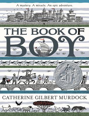
The Book of Boy is Here!


Wednesday, December 18, 2013
Revisiting Illustrations
 I used to think that it was a sin to rework an illustration after it had been published. But there’s plenty of historical precedence for post-publication alterations: Howard Pyle, for example, did a lot of picture-tweaking for a variety of reasons (some of which I discussed here and here).
Then again, Pyle - and plenty of other authors, too - sometimes made major revisions to his stories in between serial and book publication - changing plot lines, cutting characters and scenes, etc. - and didn’t, to my knowledge, catch any flak for his actions.
So, I wondered, if a book is out of print with no real chance of being revived, why not revisit its illustrations in hopes of breathing new life into them? I decided to do a little experiment...
The picture shown here started out as my illustration for the now long-gone Jonkonnu by Amy Littlesugar, which deals with an incident in the life of Winslow Homer - and for which I tried to emulate Homer’s style as best I could with limited skills. I didn’t rework the picture with real ink and paint, however: I just digitally altered a low-resolution scan of a proof (hence the not-great quality).
I’m still not brave or foolhardy enough to start messing with my original drawings and paintings, but it could be only a matter of time.
Friday, November 22, 2013
JFK
 I painted this full-length, yet only six-inch-high portrait of President Kennedy for Jean Karl’s America Alive. (Pardon the coffee stains and general grubbiness.)
Tuesday, July 16, 2013
Characters from a Lost Novel
 I confess: the “lost novel” was never lost at all because it was never there in the first place. This page of character studies was more or less a doodle: just me trying out a combination of ink and acrylic paint on a piece of bristol board with no real plan in mind.
Wednesday, May 18, 2011
The Turtle on the Fence Post
 A cropped version of this illustration appeared in The New York Times Book Review for March 24, 2002. I made it for William Kennedy’s review of Joe Klein’s book, The Natural: The Misunderstood Presidency of Bill Clinton.

The Book Review gave out a particular photo of Bill Clinton to a number of artists, including Barry Blitt, Henrik Drescher, Peter Blegvad, Philip Burke, Robert Grossman, Thomas Fuchs - maybe others - and me. Each of us was supposed to re-imagine the picture and then our results would be ganged-up on the cover and, it was hoped, evoke what Kennedy described as “the duality, triality, quadrality of Bill Clinton's nature and outlook.”
But I (and maybe some of the others) misunderstood the directive. I think I should have shown Clinton’s whole head and shoulders instead of just a fragment of him. So I wound up making the above piece, but while it missed getting on the cover, it was used inside with the review itself.
My mixed-up medium was colored ink on scratchboard, glued to a scrap of Color-Aid paper.
See my other take on Bill Clinton, here.
Monday, May 16, 2011
They Really Are A Scream
Sometimes a better idea comes after I’ve turned in the final art. Other times the best idea arrives in the nick of time.
Take the Adams family. (No, not them.) My assignment for the New York Times Book Review (given on a Friday afternoon, I think, and due before noon Monday) was to illustrate Jeff Shesol's review of America's First Dynasty: The Adamses, 1735-1918 by Richard Brookhiser, in which “his subject is not one life but four - the favorite sons of successive generations of the Adams family” - i.e. John Adams, John Quincy Adams, Charles Francis Adams and Henry Adams.
For better or worse, I’m drawn to American historical subjects: I love to research them, but often I get too caught up in all the details which, in turn, can get in the way of making an interesting picture. Editorial work, though, is (to me) less about making a well-researched or historically accurate depiction of a particular time, place, or person, and more about making something that catches the essence of the piece it illustrates - or, at least, catches the eye.
Despite my immediate attraction to the subject, I didn’t know how to handle it pictorially. One page of notes shows that I considered parodying (or parroting) The Flying Wallendas and The Brady Bunch...

“Clever” - but not very interesting. Nor was the “family gallery” approach I tried, or my half-baked variant of Norman Rockwell’s The Gossips...

Finally, while vainly attempting to capture the features of Charles Francis Adams, it dawned on me that most people probably wouldn’t pick be able to pick Charles Francis Adams (or even Henry Adams) out of a line up, so why bother with straightforward portraits? Why not focus on things they had in common besides their surname: their eyes, their ears, their bald heads? And why not take a more abstract, or less literal approach, which might be more effective in the end?

Maybe I pushed the similarities more than what was “true,” but I felt like I was on to something. And maybe I was paying unconscious homage to one early-to-mid-1960s album cover or another - was it Meet the Beatles!? I don’t know.

And since David McCullough’s John Adams came out not long before this review appeared, I figured the Times-reading masses would probably recognize the Adams on the jacket:


So I replaced John Adams’ understated hairstyle with the bushier variety. But that obscured the face of his son, John Quincy Adams, so I switched the order, tracing and cutting and pasting (with real-live scissors and tape)...

And then I made the final art in ink on scratchboard:

My chief reservation about this is that my pen and “scratching” work should have been less delicate: it gets fuzzy when reduced, or printed on newsprint. Even so, I still like this Adams Family. Neat, sweet, petite.
Take the Adams family. (No, not them.) My assignment for the New York Times Book Review (given on a Friday afternoon, I think, and due before noon Monday) was to illustrate Jeff Shesol's review of America's First Dynasty: The Adamses, 1735-1918 by Richard Brookhiser, in which “his subject is not one life but four - the favorite sons of successive generations of the Adams family” - i.e. John Adams, John Quincy Adams, Charles Francis Adams and Henry Adams.
For better or worse, I’m drawn to American historical subjects: I love to research them, but often I get too caught up in all the details which, in turn, can get in the way of making an interesting picture. Editorial work, though, is (to me) less about making a well-researched or historically accurate depiction of a particular time, place, or person, and more about making something that catches the essence of the piece it illustrates - or, at least, catches the eye.
Despite my immediate attraction to the subject, I didn’t know how to handle it pictorially. One page of notes shows that I considered parodying (or parroting) The Flying Wallendas and The Brady Bunch...

“Clever” - but not very interesting. Nor was the “family gallery” approach I tried, or my half-baked variant of Norman Rockwell’s The Gossips...

Finally, while vainly attempting to capture the features of Charles Francis Adams, it dawned on me that most people probably wouldn’t pick be able to pick Charles Francis Adams (or even Henry Adams) out of a line up, so why bother with straightforward portraits? Why not focus on things they had in common besides their surname: their eyes, their ears, their bald heads? And why not take a more abstract, or less literal approach, which might be more effective in the end?

Maybe I pushed the similarities more than what was “true,” but I felt like I was on to something. And maybe I was paying unconscious homage to one early-to-mid-1960s album cover or another - was it Meet the Beatles!? I don’t know.

And since David McCullough’s John Adams came out not long before this review appeared, I figured the Times-reading masses would probably recognize the Adams on the jacket:
So I replaced John Adams’ understated hairstyle with the bushier variety. But that obscured the face of his son, John Quincy Adams, so I switched the order, tracing and cutting and pasting (with real-live scissors and tape)...

And then I made the final art in ink on scratchboard:

My chief reservation about this is that my pen and “scratching” work should have been less delicate: it gets fuzzy when reduced, or printed on newsprint. Even so, I still like this Adams Family. Neat, sweet, petite.
Tuesday, May 10, 2011
Enemy Women for the New York Times
 Sometimes my first ideas are stronger than those that go into print. This might be a case in point: my New York Times Book Review cover highlighting John Vernon’s review of Paulette Jiles’ Enemy Women: A Novel.

The book is set during the Civil War and centers on an 18-year-old woman from the Missouri Ozarks, who is arrested on suspicion of being a Confederate spy and is thrown into a St. Louis prison. There, the prison commandant (a Union major) interrogates - but soon falls in love with - his captive, and ultimately helps her escape.
But how to illustrate that, or, rather, how to illustrate a review that has no physical descriptions of the characters, etc.? (Book Review illustrators are - or were - only provided the text of the review, not the book itself.)
Above is an early, more “realized” sketch: no facial features, but, I hoped, their hands and clothing and setting would hint enough at what the book was about. And here is a page of pencil notes for it - as well as another concept: a crazy-quilt map of Missouri that, I realized, would be better to stitch together with real bits of cloth, rather than to paint (something I wasn’t equipped to risk trying).
 My “hand holding” design was turned down, though. So I ran out and got the novel and searched for descriptions of the two main characters. I wound up settling on an “ambrotype” idea, with a “magic realism” slant, with the major desperately - maybe too desperately - reaching out toward his love. For the major’s pose - and in the interest of time - I adapted one of my favorite Sidney Paget pictures of Sherlock Holmes, illustrating one of my favorite lines in one of my favorite stories, “The Adventure of the Reigate Squire“ (or “Squires” or “Puzzle”): “You’ve done it now, Watson,” said he, coolly. “A pretty mess you've made of the carpet.”
 And so this color sketch was born - as was this poor Photoshop tweak where I raised the major’s arm and closed the ambrotype case a little:
 Tthe major “breaking through the frame” idea was nixed, however. I had to keep him under glass, and the end result, below, is much more staid and, I think, less intriguing. That orange surface is supposed to be wood, but it looks like the ambrotype case is precariously balanced on it or suspended from it: looking at it now, I should have placed the case on top of a table or the like. But sometimes the better ideas come too late - or too early.
 And here is the image as published....

Tuesday, May 3, 2011
Alexander Hamilton and George Washington
Jean Fritz’s George Washington's Breakfast and And Then What Happened, Paul Revere? really spurred my interest in American history, so it was a treat to make a few illustrations for her latest book, Alexander Hamilton: The Outsider.

(It’s also available via Indiebound.)
The book was to be illustrated with many old engravings and drawings (including several by Howard Pyle) and my role was to create a frontispiece and five “section openers” that would hint at the themes discussed in the subsequent chapters, but which would not necessarily be literal depictions of specific events. More “evocations” than illustrations.
For the section titled “Aide-de-Camp” I needed to show Hamilton with George Washington, who had picked the young officer to serve on his staff in 1777. Although he was a proven and gallant fighter, Hamilton’s job mostly involved writing, but he got to a point where, as Ron Chernow says in his monumental biography:

But I got carried away with symmetry of the thing, and the figures began to look too much like an antique jumping-jack toy. So I started over. This time I placed them outside, as if on the way back from inspecting the soldiers’ cabins at Morristown or at Valley Forge, Pennsylvania.

I wasn’t so sure about Hamilton’s headgear, though: he was an artillery officer, but I thought that, while serving as Washington’s aide, maybe he wore a tricorne hat, so I replaced the more helmet-like cap in the final art. I also added a decorative border to the final art, which I made with ink on scratchboard. And voilà!

(It’s also available via Indiebound.)
The book was to be illustrated with many old engravings and drawings (including several by Howard Pyle) and my role was to create a frontispiece and five “section openers” that would hint at the themes discussed in the subsequent chapters, but which would not necessarily be literal depictions of specific events. More “evocations” than illustrations.
For the section titled “Aide-de-Camp” I needed to show Hamilton with George Washington, who had picked the young officer to serve on his staff in 1777. Although he was a proven and gallant fighter, Hamilton’s job mostly involved writing, but he got to a point where, as Ron Chernow says in his monumental biography:
He was able to project himself into Washington’s mind and intuit what the general wanted to say, writing it up with instinctive tact and deft diplomatic skills. It was an inspired act of ventriloquism: Washington gave a few general hints and, presto, out popped Hamilton’s letter in record time.So, initially, I decided to show Hamilton at his desk, with the general looming above him. The setting I chose was inside Washington’s Headquarters (also known as the Ford Mansion) in Morristown, New Jersey. The curved top of the image comfortably accommodated the fanlight of the front door of the house...

But I got carried away with symmetry of the thing, and the figures began to look too much like an antique jumping-jack toy. So I started over. This time I placed them outside, as if on the way back from inspecting the soldiers’ cabins at Morristown or at Valley Forge, Pennsylvania.

I wasn’t so sure about Hamilton’s headgear, though: he was an artillery officer, but I thought that, while serving as Washington’s aide, maybe he wore a tricorne hat, so I replaced the more helmet-like cap in the final art. I also added a decorative border to the final art, which I made with ink on scratchboard. And voilà!

Tuesday, February 22, 2011
George Washington
 General George Washington in raw umber and titanium white acrylic paint on Strathmore Aquarius II paper.
Monday, February 21, 2011
Abraham Lincoln
 A painting of Abraham Lincoln for Presidents Day. I made it for America Alive, a long-dead book.
Monday, January 31, 2011
Nyssa as Cilla
 An ancient acrylic study, made from a photograph I took of my niece, Nyssa, posing as “Cilla,” the fictional character who co--starred with the very real Winslow Homer in Jonkonnu by Amy Littlesugar.
Saturday, July 10, 2010
Jolly Flatboatpigs in Port

Here's a painting I did, inspired by the "Jolly Flatboatmen in Port" by the wonderful Missourian artist George Caleb Bingham, who has unwittingly provided me with lots and lots of raw material over the years.
Sunday, November 29, 2009
My Mark Twain
Today is Mark Twain's 174th birthday, so behold my painting of him - well, my painting of a part of him, which, in turn, was part of an experimental series where I tried to make recognizable pictures of certain notable people while only showing small portions of said people...if that makes any sense. As Twain himself said: "...language is a treacherous thing, a most unsure vehicle..." But maybe I'm just a bad driver.


Friday, November 27, 2009
Another Bingham Pig
Another pig drawing generated from a painting by the great George Caleb Bingham.


Friday, November 13, 2009
Family Portrait

It's my grandmother's 113th birthday today, so how better to celebrate than by...turning her family into pigs? The source photograph was taken in 1906 or 1907 and shows most of the Braun brood of Rudna, Banat, a Donauschwaben village then in Hungary and now in Romania. My grandmother is in the middle row, far left. I made my painting some time ago and confess that I didn't quite catch my great-uncle Dominik's bewildered expression (middle row, far right), though the frown of my first cousin once removed (Gyula Bank, dead center) translated pretty well.

Wednesday, November 11, 2009
A Congressman is a Hog!
"You can't use tact with a Congressman! A Congressman is a hog! You must take a stick and hit him on the snout!" said a member of President Grant's cabinet to Henry Adams. In this case the hog, or, rather, the model for the hog was, again, the unwitting Senator Stephen A. Douglas (1813-1861), as photographed by Mathew Brady.


Tuesday, November 10, 2009
Like Monkeys
"The bears swarmed over the fence like monkeys" - a bloodthirsty yet cuddly scene from Robert Louis Stevenson's Treasure Island as illustrated in 1911 by N. C. Wyeth and subsequently bastardized by me, Ian Schoenherr, in ink and acrylic on a plywood panel measuring 8 x 10 inches.
Yes, these critters are repeat offenders: Angus, with the red kerchief, appears solo here and with his compatriots Harold (on the left), Big Bear (in plaid with an eye patch), and Bailey (with the skull-and-bones on his hat) in a Teddy Bear Pow Wow. And, of course, Bailey also shows up in more respectable circumstances here.

Yes, these critters are repeat offenders: Angus, with the red kerchief, appears solo here and with his compatriots Harold (on the left), Big Bear (in plaid with an eye patch), and Bailey (with the skull-and-bones on his hat) in a Teddy Bear Pow Wow. And, of course, Bailey also shows up in more respectable circumstances here.

Monday, November 9, 2009
A Bear and His Bear
Another example of a picture of a human which I morphed into an animal. The source was an 1840's daguerreotype I found on page 26 of American Album by Oliver Jensen, Joan Paterson Kerr, and Murray Belsky (American Heritage Publishing Co., Inc., 1968) - a terrific book, filled, as the subtitle states, with "Rare Photographs Collected by The Editors of American Heritage." I don't know the name of the gentleman bear, but the well-loved companion tucked under his arm is named Bailey, made circa 1930 by Bernhard Hermann in Sonneberg, Germany. My acrylic-on-paper painting measures 2 7/8 x 4 1/4 inches.


Young Pig Lincoln
In addition to re-imagining my favorite paintings (as seen in this and that post), I also enjoy adapting old photographs for my own purposes. Here, for instance, I turned Abraham Lincoln's son, William Wallace Lincoln (1850-1862), into a pig. Sorry, Willie! This one falls into the Tentative Ventures Into Anthropomorphism category, though, as I more or less just stuck an animal head (and some cloven feet) on a human figure, sort of the way ancient Egyptian artists often did. Since making this painting, however, I've found that I prefer my anthropomorphizing to be a "full-body experience," so I try to transform the whole person into an animal. I think the results are more convincing.


Wednesday, November 4, 2009
Furry Traders Descending the Missouri
Sometimes when I want to make a picture, but am void of ideas, I'll take a work by an artist I admire and "recast" it with pigs or mice or teddy bears. Here's an example, painted with acrylic and ink on a scrap of plywood measuring 10 x 8 inches. It's based on Fur Traders Descending the Missouri by George Caleb Bingham, which now hangs in the Metropolitan Museum of Art in New York City.


Subscribe to:
Posts (Atom)


 Posts


